Sugar River Eye Care
Sugar River Eye Care’s mission is to provide personalized, authentic eye care that exceeds expectations.
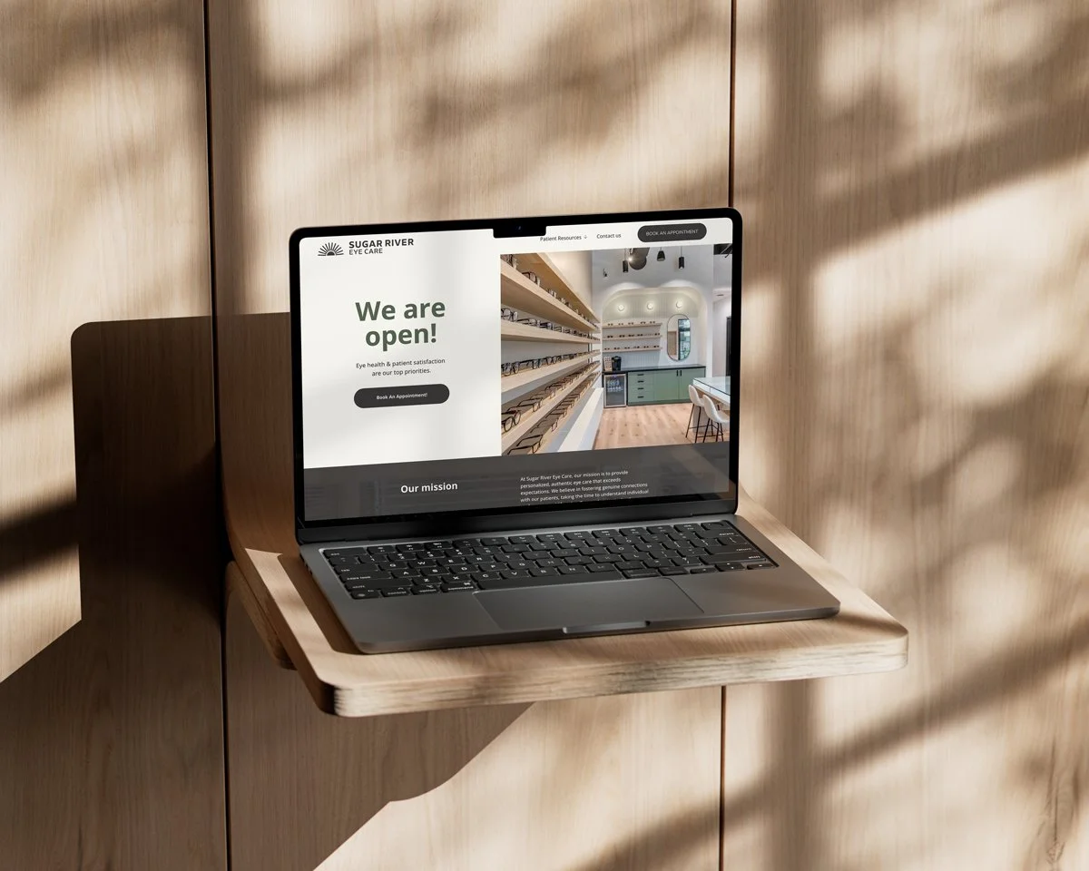
Full Visual Identity Package, Print Design, Social Media Kit, Website
Horizontal
Stacked
Icon & Alt Icon
The owner came to Studio Roger earlier this year seeking a brand package that could reflect her vision for the practice: a personal and family friendly, yet upscale and innovative practice that also pays homage to the idyllic Sugar River region.
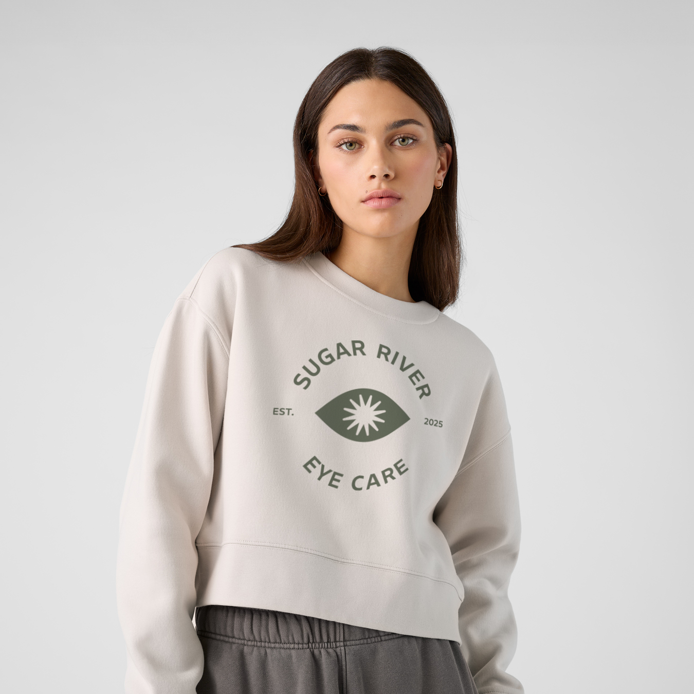
The resulting logomark brings all of that together—at first glance, a sun over the river; look closer, and you’ll see inspiration from classic optometry charts. Complete the circle, and it becomes an eye. We paired this with Brisbane by Leinster Foundry, a typeface designed for both branding and wayfinding—legible, approachable, and built to last.
The full identity carries that balance forward: fresh, crisp iconography, a bright, timeless color palette, and design details that feel warm and approachable while reflecting the practice’s cutting-edge technology.
The color palette was designed around the interior of the practice to ensure and seamless experience from the practice itself and all its branding materials.
Iconography was inspired by the Sugar River region with sunburst icons, waves to symbolize the river, and horizontal lines for the farmland. Other icons were an expansion on the logo, and inspired by old optometry charts
Custom Color Palette & Icons


